Get the perfect custom design, every time
With the world's #1 custom design marketplace
freelance designers
designs per project
completed projects
Our design services


Only the best freelance design
Here's why 100,000+ businesses have chosen DesignCrowd:
-
Save money & time
Our custom design starts at a low price with options to meet any budget. On average, projects start to receive designs within a few hours.
-
More creativity
With freelance designers across the globe competing on your project, you'll receive heaps of design ideas - you just need to choose the best.
-
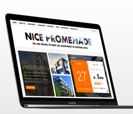
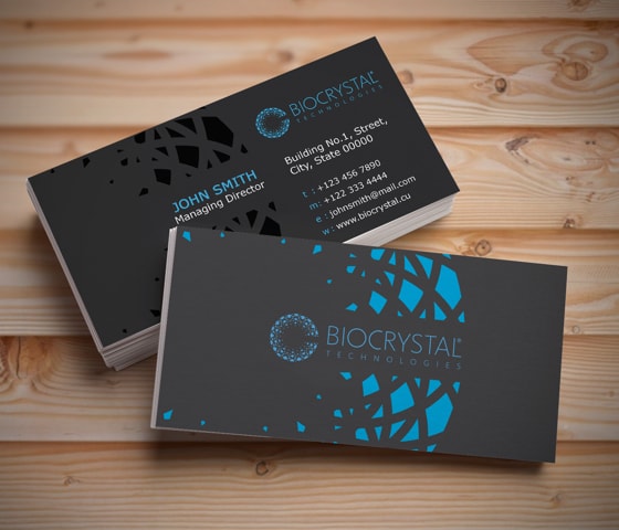
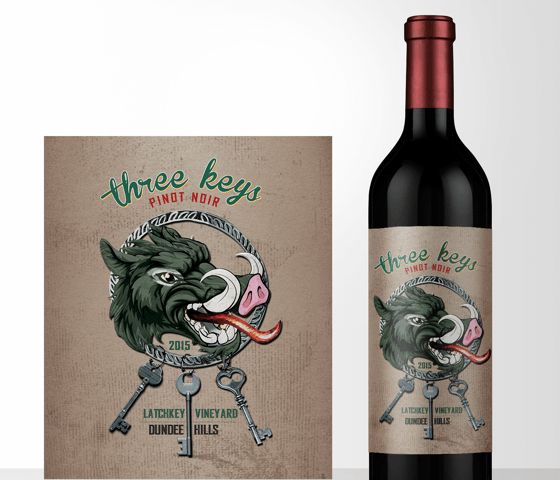
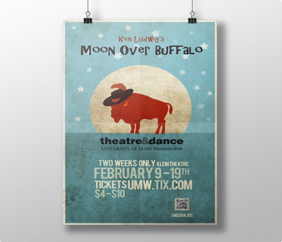
A world of design
Professional freelance designers around the world ready to create you the perfect logo, website, business card & more!
-
Money back guarantee*
If you're not satisfied with the designs and don't get the perfect design for your business, get your money back*


Let's get started
I need a design created
Get the perfect design for your budget from our creative community.
Get started nowI want to work
Do you want to earn money, find unlimited clients and build your freelance career?
Join NowSee why customers love DesignCrowd - 4.9 average from 3,059 ratings
Here's what real businesses say about DesignCrowd
-
“By using DesignCrowd we have saved at least 50% compared to our normal creative agencies. Crowdsourcing is a brilliant way to pick the creative brains of a global design team.”
-
“I chose DesignCrowd because I liked the idea of having designers from all over the world submit. I received over 70 designs to choose from and have been very happy with my new logo. ”
-
“The speed and efficiency in receiving my designs was very impressive. Many thanks for your quick respones to my queries. Much appreciated.”
-
“Great experience with DesignCrowd. I received 100+ designs from 40 designers. Designers offered logos based exactly on what I requested and fresh ideas as well. This is an awesome service. ”
-
“DesignCrowd changes the game for getting creative work done. You get access to an army of designers who are great at what they do. My personal opinion? Its a great service and I highly recommend it. ”